The Complete Guide to Creating a Website for Your Startup

New startups are appearing around the globe thanks to opportunities created through the new global economy. The good news is this:
New startups lead to a growing need for more business websites. In turn, this means more work for web designers.
These aren’t isolated neighborhood businesses either. Their outreach is global and digital. They need websites that are optimized for conversions and flexible. So, here’s your chance. You can serve these new entrepreneurs by creating great websites for them.
How do you go about it?
Below are 5 simple steps to create eye-catching, high-converting websites, with helpful examples.
5 Steps to Building Astonishing Business Startup Websites
Step 1: Choose a mesmerizing color palette
There are 3 simple rules to follow when choosing a color palette for a business startup website:
- You want a color palette that instantly attracts attention
- It needs to be on-brand
- It needs to visually support the message you’re trying to get across
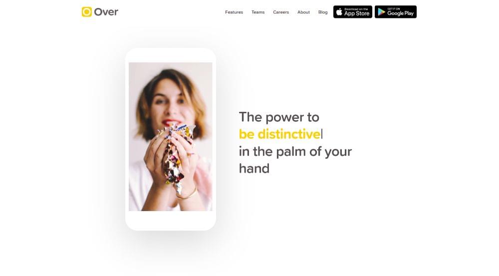
Over‘s bold color touches instantly attract attention.
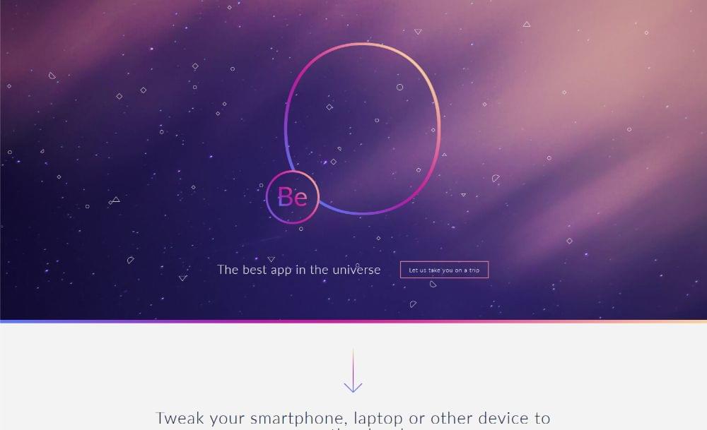
This pre-built website, included in the Be Theme library, offers another example of an attention-grabbing color palette.
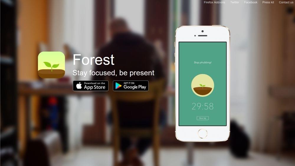
Forest does an excellent job at aligning its color palette with its brand — earth tones such as greens and browns are throughout. These palettes contribute to a visually memorable website.
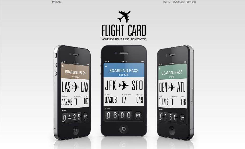
FlightCard‘s subtle and cold color palette is a perfect choice for reinforcing its message: boarding passes have become so easy to use that you barely pay attention to them.
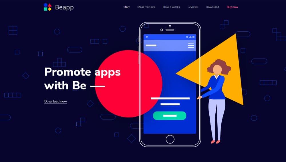
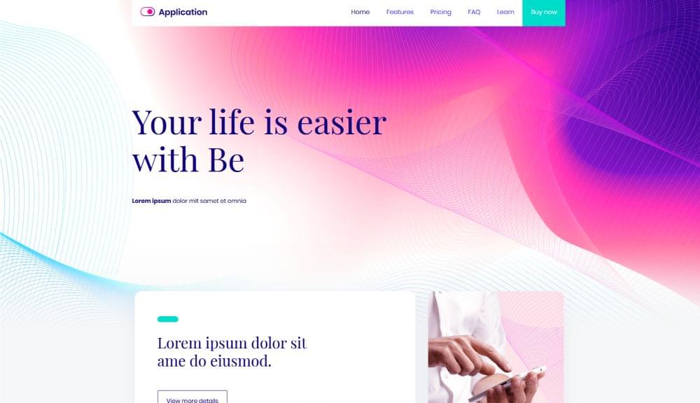
And if you’re in need of a color palette that will appeal to a larger audience, BeApp2 can serve you perfectly well.
Step 2: Display crystal-clear product pics
This shouldn’t be difficult to figure out. People want to know exactly what they are being offered. It has little to do with the color of the icons you’re using.
A business startup has to present its products with flair and dignity. Its product pics need to give it an extra edge over huge businesses that have budgets to match.
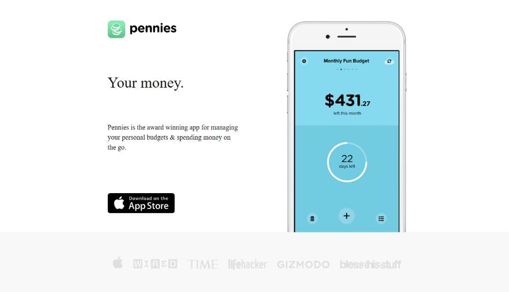
Pennies proudly displays what its award-winning app looks likes on a smartphone. Just by looking at the page you can tell how easy it is to use and even figure out how the color codes work.
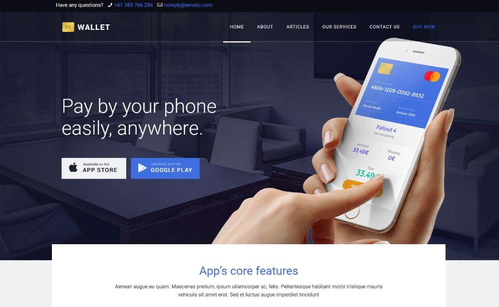
You can create a similar website with BeWallet. This pre-built website was designed from scratch for financial service startups. There’s a huge audience of them in dire need of a better website.
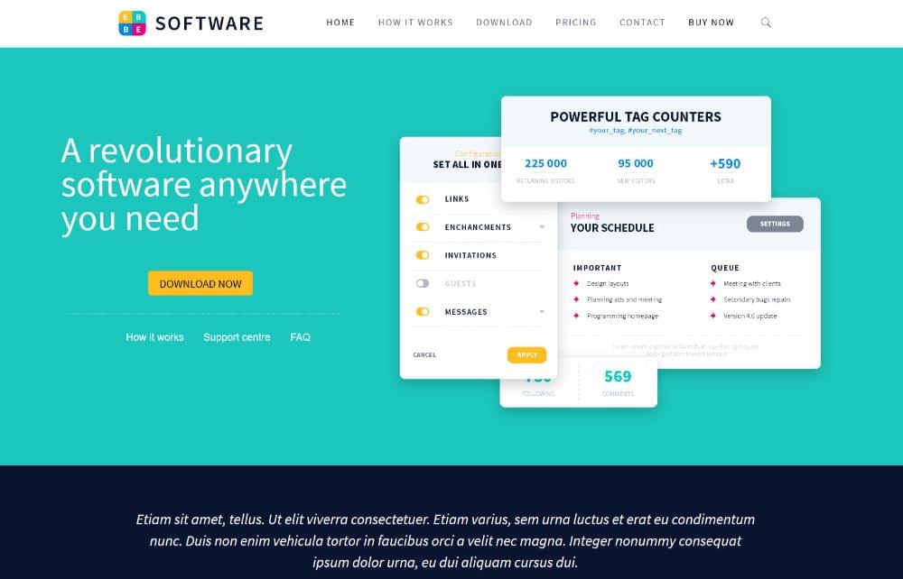
Or, you could choose a more general pre-built website like BeSoftware to display a new business startup’s crystal-clear pics.
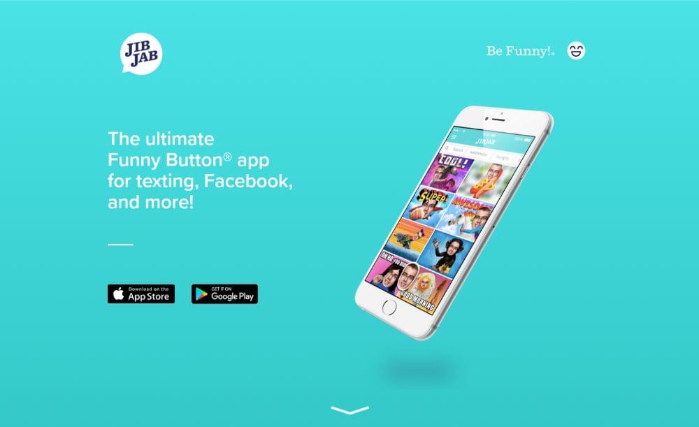
JibJab takes things a step further. Its before and after approach is a persuasive and simple tactic to show what the startup offers.
Step 3: Show visitors how the startup serves them
The key here is to help visitors imagine themselves as actual customers by showing how the startup will serve them.
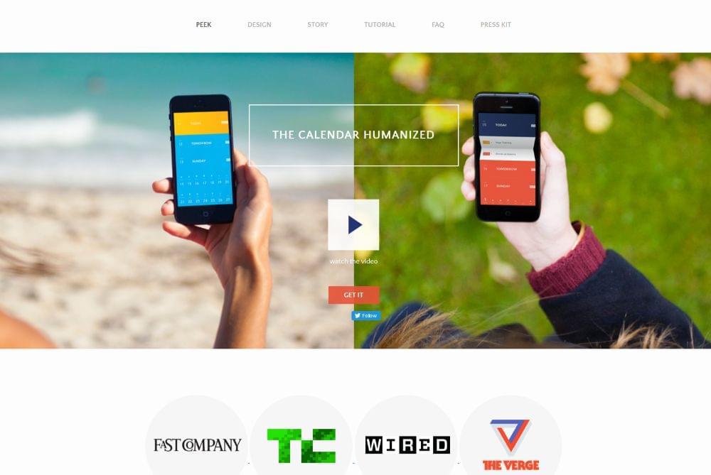
PeekCalendar has placed a video in the hero section. It shows how people can benefit from the new business.
BeApp3 allows you to incorporate product pics and a video to show how the new startup will benefit people using its products and services.
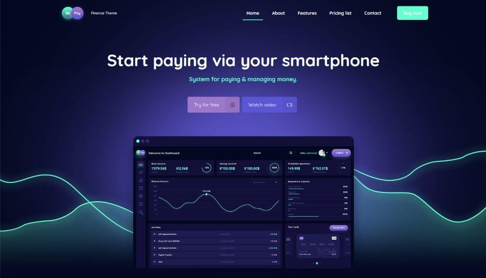
BePay has a Watch Video CTA button right above the fold that encourages your visitors to immediately view a product demo.
CutestPaw will soften up the hardest heart. Its entire how-to is cleverly rolled up into one single image: a hero shot showing how the new business will meet users’ specific needs.

Step 4: Use whitespace
You can overuse whitespace, but often the more there is, the better. Whitespace is the #1 visual design element for a startup website. You want to be able to work with as much space as possible to highlight your main messages and product shots.
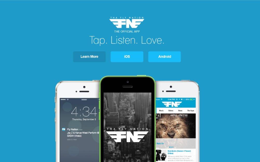
Tha Fly Nation‘s clean, airy design is pleasing to the eye and allows it to focus on the most important elements.
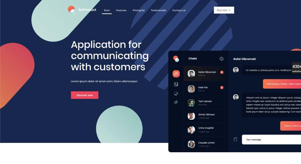
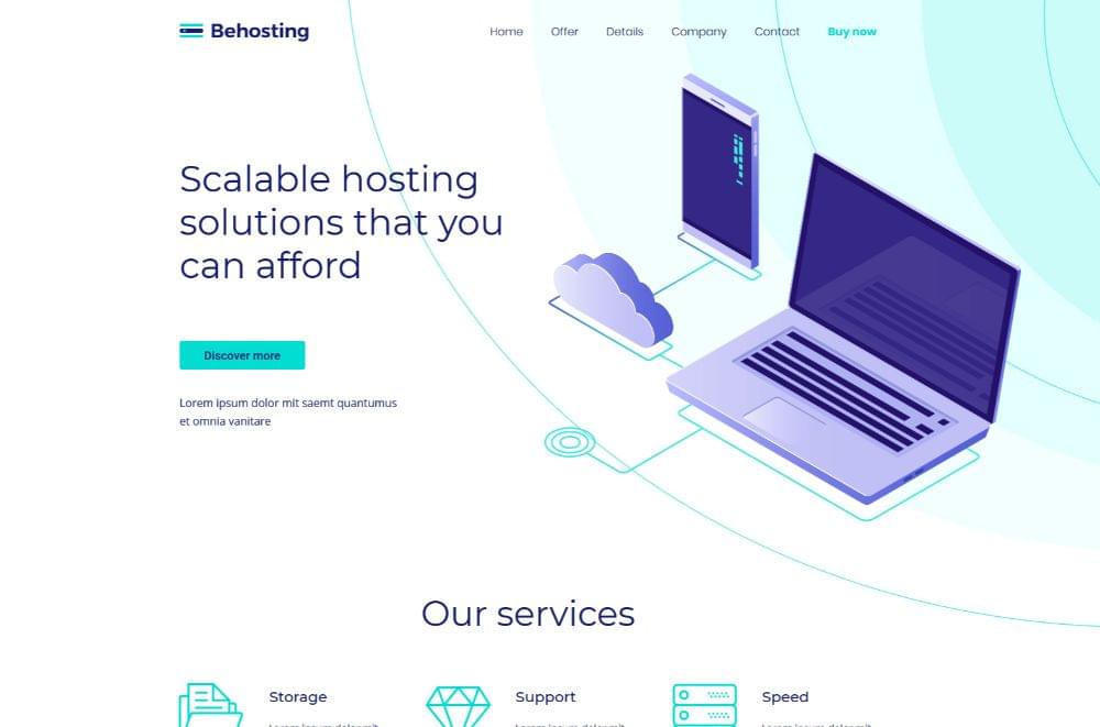
You can create a similar startup website with BeProduct4 or BeHosting2. These are pre-built websites where blank space is used to enhance user experience and emphasize the critical elements on the page.
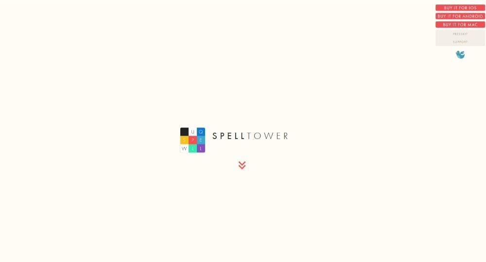
SpellTower is perhaps the most extreme when it comes to whitespace. It is part of their brand and its minimalist design drives the message home.
Step 5: Design CTAs that grab users by the eyeballs
An easy-to-locate CTA button doesn’t always cut it. If you want to convert visitors into users, you want a CTA button that’s impossible to ignore – big, bright, and bold. It’s so bright that a visitor feels compelled to click on it!
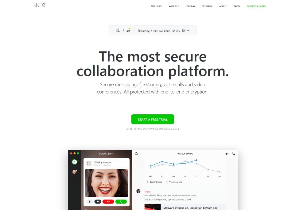
Wire‘s CTA button clearly stands out above the fold. It has a bold color, it’s big enough to draw your attention once you’ve read the headline, and it’s centered on the page so it acts as a “gate” that must be clicked to move forward.
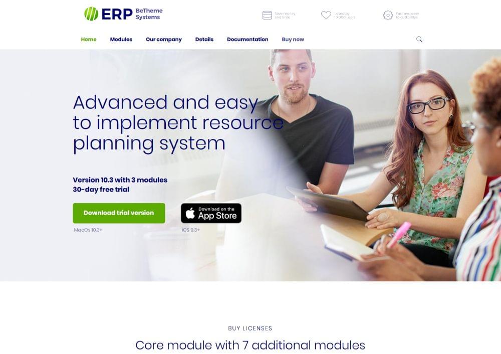
BeERP uses the same bright-green button for its main CTA (the one you want your visitors to click). A secondary, plain button is to the right.
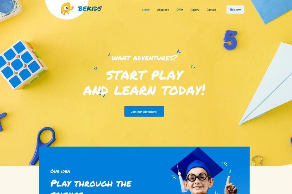
You can also direct attention to your CTA by having it match other elements on the page. A great example is BeKids. Here, the blue CTA button matches the visual elements in the hero section.
Conclusion
Follow these surefire steps so you can present your client with a website that is both eye-catching and built for conversion. Websites that feature stunning visuals and clever uses of white space create the kind of visitors a startup needs.
If you’re fortunate to grab a good share of new business, you could easily find yourself overloaded. In this case, you can safely use websites that have been built from the ground up specifically for businesses.
You’ll find the most generous gallery on Be Theme and its library of over 450+ pre-built websites to choose from. Pre-built websites you can customize to your liking.
These pre-built websites are functional, visually impressive, and feature interactive elements, stunning effects, and intuitive navigation. Simply personalize the one you select to fit your business or that of your client, and you’re good to go!
Further reading:
☞ On-Demand App : Types, Models, Use Case & Challenges
☞ How is eCommerce web development the best ROI?
☞ CSS Border Transition Effects
☞ Serverless PHP on App Engine and Cloud Firestore with Firevel (serverless Laravel framework)
Suggest:
☞ What To Learn To Become a Python Backend Developer
☞ 40+ Online Tools & Resources For Web Developers & Designers
☞ Top 4 Programming Languages to Learn in 2019 to Get a Job
☞ Top 4 Programming Languages to Learn In 2019
☞ The BEST Blockchain/Web 3.0 Project Ideas - For Developers