Build a Skeleton Component in React for Better UX

Do you know what a skeleton component is for? It’s a component that presents content, while data is being fetched. Users easily get tired or bored waiting for content. If you just show them a white screen, the majority will leave your site, which you don’t want.
In this article, I will demonstrate how to write a skeleton component and how to use it.
Prerequisites
This article assumes you know React. But don’t worry, if you have experience with Vue, Angular, or any other JavaScript framework instead, you’ll easily understand this article.
Also, I used CRA (Create-React-App) for a faster setup.
Set Up the React Project
npx create-react-app skeleton
I created the simple basic React project using CRA. The project structure is as follows:
import axios from 'axios';
import React, { useEffect, useState } from 'react';

function App() {
  const [data, setData] = useState([]);

  useEffect(() => {
    axios
      .get('https://reqres.in/api/users?page=2')
      .then((res) => setData(res.data.data));
  }, []);

  return (
    <div className="App">
      <ul className="contentWrapper">
        {data.length > 0 &&
          data.map((item) => {
            return (
              <li key={item.id} className="item">
                <div>
                  <img className="img" src={item.avatar} />
                </div>
                <div className="info">
                  <p>
                    <strong>
                      {item.first_name} {item.last_name}
                    </strong>
                  </p>
                  <p>{item.email}</p>
                </div>
              </li>
            );
          })}
      </ul>
    </div>
  );
}

export default App;
medium_skeleton_app.js
The page looks like this when I run npm start:

What’s a Skeleton UI?
A skeleton UI refers to an empty structured UI, placed where the content will be.

Original source of the image is reactjsexample
You’ve probably seen loading components when visiting websites. They’re also user-friendly UI components as they inform users that data is being fetched under the hood.
Usually, those loading bars or spinners aren’t the only thing to happen. Commonly the background is also dimmed. Spinners or bars that show the data is being loaded is a good strategy, they help users understand that the page or the container is loading.
These days, many websites show alternative UI components to users to reduce boring waiting time. The most common pattern of the skeleton UI is a small box with a white background and some shiny CSS animation.
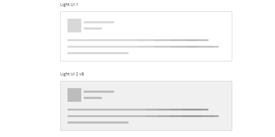
Original source of the image is codemyui
Not only do they fill the emptiness, but the user can interact with some other components on the page.
Now, I’m going to show you how to make them with an example.
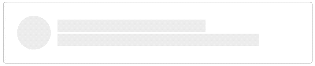
1. Structure the Skeleton UI
The step is, obviously, to make the empty skeleton components:
import './Skeleton.css';

import React from 'react';

const Skeleton = () => {
  return (
    <li className="skeleton-item">
      <div>
        <div className="skeleton-img" />
      </div>
      <div className="skeleton-info">
        <p className="skeleton-name" />
        <p className="skeleton-email" />
      </div>
    </li>
  );
};

export default Skeleton;
medium_skeleton_structure.js
The skeleton should look the same as the content as much as possible
When you make the skeleton component, there’s one thing you should be careful about. The purpose of the skeleton UI is to reduce a boring wait for the data, so they shouldn’t look too different from the real UI components. If they’re too different, users may feel like the skeleton is another independent UI component.
2. CSS animation
The second step is to choose the animation that will go through the skeleton. Some people use pure CSS animation and some people use an image. I personally prefer to use an image, especially when the animation contains some gradient background colors.
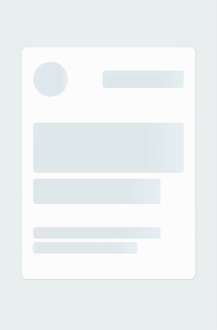
Original source of the image is npm
You see the white gradient that goes through the skeleton from the left to the right? To paint that every 16.6ms is an unnecessary amount of work for the CPU — it has to calculate every gradient color value on each spot and work with GPU to represent it on the screen. For this reason, I prefer to use an image.
However, in this example, I’m going to use pure CSS to show you how to do it. It may not always be possible to use an image.
@keyframes loading {
  0% {
    transform: translateX(0);
  }
  50%,
  100% {
    transform: translateX(460px);
  }
}

.skeleton-item::before {
  content: '';
  position: absolute;
  top: 0;
  left: 0;
  width: 30px;
  height: 100%;
  background: linear-gradient(to right, #f2f2f2, #ddd, #f2f2f2);
  animation: loading 2s infinite linear;
}
medium_skeleton_wrong_css.scss
I made a gradient background like so to the element that wraps the whole contents. But, this looks weird — you can see the whole gradient pillar. We only want it to show in the gray area.
To achieve this we add the pseudo-class to every gray element.
Remember that the element the gradient background belongs to should have the styles like this:
.element {
  overflow: hidden;
  position: relative;
}
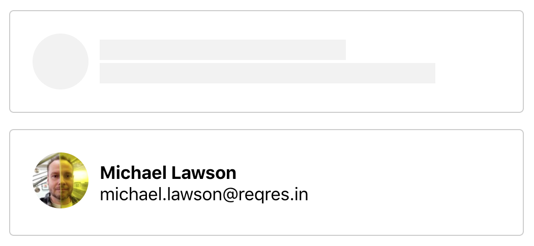
Comparison
Now let’s compare two different cases — when the skeleton exists and when it doesn’t.

It’s obvious that the skeleton components look much better than just a white background while the data is being fetched. You could bring a loading bar component to replace the white background.
Code in Sandbox
Here’s the source code of this example.
https://codesandbox.io/s/skeleton-vtn9m?from-embed
Other Examples
You may be wondering how other web sites have adopted the skeleton U. Here are some quality examples of it in use.
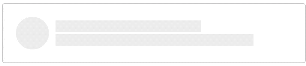
Slack
Original source of the image is from css-tricks
Slack shows the users the loading bar and the skeleton components together. One fun stuff they made is that they show the users some random messages, such as “More Holy Moly!”, so people won’t get too bored, which I think is a good strategy.

Pinterest has very simple skeletons. The main contents of them are images, so their skeleton doesn’t need to be complicated at all. Instead, they’ve colored each skeleton component randomly.
Skyscanner

Skyscanner has a quite similar skeleton UI to the example I made in this post. Loading flight data can take a lot of time, maybe up to a few seconds. Developers handling data of that size should always be careful not to lose their customers’ attention. The skeleton or loading bar is important for them.
Conclusion
Of course, adopting the skeleton UI won’t always be the best solution for you. What is important is to know which UI components seem good on your site. Sometimes a loading bar is enough and sometimes you might need something more.
Suggest:
☞ JavaScript for React Developers | Mosh
☞ React Tutorial - Learn React - React Crash Course [2019]
☞ Learn React - Full Course for Beginners - React Tutorial 2019
☞ React + TypeScript : Why and How