Epidemic Modeling 101: Or why your CoVID19 exponential fits are wrong

Over the past few weeks, a terrible affliction has been spreading across the world. Otherwise healthy and productive members of society have been infected with this devastating illness that causes them to fire up Excel, Python or R and start extrapolating the latest numbers of confirmed CoVID-19 cases in their town, state, country or even the entire world!
All joking aside, the severity of the current SARS-CoV-2 epidemic is undeniable and it is only natural that people will deal with the added stress in their lives (and extra free time due to lockdown procedures) in various ways.
A particularly afflicted demographics has been my own, that of Physicists, resulting in the rise of a small cottage industry of blog posts, LinkedIn publications and even arXiv papers with their best attempts at modeling the spread of the disease, with little or no understanding of dynamics underlying epidemic spreading. Once again, the immortal words of Simon DeDeo have been proven true:
Invariably, our fearless followers of John Snow (not the one you’re thinking of) end up with some variation of this plot comparing the cumulative number of cases or deaths in various countries as a function of time with a straight exponential growth rate.
Financial Times, March 29, 2020
Extrapolation to unrealistic numbers, forecasts about when a country might overtake another, considerations about the success or failure of containment measures and various other shenanigans ensue.
Bringing order to a chaotic world has always been the driving force of Human progress and it can be argued that this is simply its latest incarnation: The Numerati trying to use their modeling and Data Science skills to make sense of the world around them. A trend that has led in recent years to impressive progress in Machine Learning, Artificial Intelligence, and Data Science. Unfortunately, while there are good reasons to expect the early stages of epidemic spread to be exponential, there are many practical factors conspiring against the efficacy of simple curve fitting and a little background knowledge about traditional epidemic modeling can go a long way.
What follows is my personal perspective, as an individual with some real world experience in epidemic modeling during previous pandemics and shouldn’t reflect on any group or institution I might be affiliated with.
Compartmental Models
Mathematical modeling in Epidemiology has a long and rich history, dating as far back as the 1920s with Kermack–McKendrick theory. The basic idea is deceptively simple: we can divide the population into different compartments representing the different stages of the disease and use the relative size of each compartment to model how the numbers evolve in time.
In the discussion below, I introduce several simple models and scenarios to help illustrate the issues with simply trying to do curve fitting on the empirical numbers. You can find the notebook I wrote to implement the models and generate the figures over at the GitHub repository I made specifically for this post:
https://github.com/DataForScience/Epidemiology101
SI Model
Let’s start by taking a look at the simplest possible epidemic model: The Susceptible-Infected model. Here we split our population into two compartments, the healthy compartment (usually referred to as Susceptible) and the Infectious compartment. The dynamics is also simple, when a healthy person comes in contact with an infectious person s/he becomes infected with a given probability. And, in this simple example, when you are infected, you remain infected forever. Mathematically, this is often written as:

Mathematical description fo the Susceptible-Infected model
which is just a fancy way of saying that the loss in the number of healthy people is the same as the gain in the ranks of the infected. More specifically:
- N is simply the total population size
- β is the rate of infection
- It/N is the fraction of infected people and it represents the probability that a susceptible person will encounter an infected one.
Not surprisingly, this is not a very interesting model: given enough time everyone becomes infected:
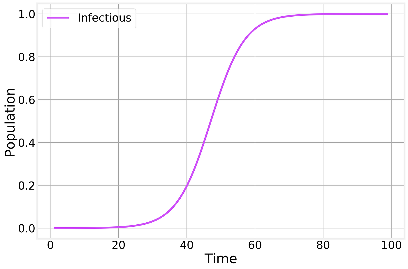
Infectious fraction of the total population as a function of time.
This simple model considers only one way to transition between compartments: From S to I through the interaction (contact) between S and I. A compact way to represent this is:

The transition in the SI model
SIR Model
More realistic epidemic models can be developed by adding further compartments and transitions. The most common such model is the Susceptible-Infectious-Recovered model:

Here we have a new compartment, Recovered, that represents the people who have had the disease in the past and have since recovered, becoming immune. The presence of Recovered slowly reduces the number of infectious individuals as they are allowed to recover.
In terms of transitions this can be written as:

The transitions in the SIR model
Where the second line represents a spontaneous (non-interacting) transition from Infectious to Recovered at a fixed rate μ.
Or, mathematically, as:

Susceptible-Infectious-Recovered model
which makes it clear that the growth in the number of Recovered depends only on the current number of Infectious individuals. It should also be noted that this model implies a constant population size:

Fixed total population
A similar expression could be written for the SI model as well.
If we now integrate the full SIR model, we find:
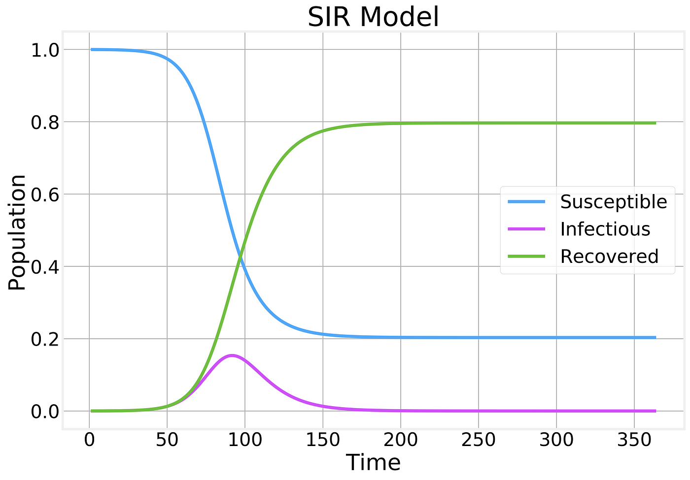
Fraction of the population in each compartment as a function of time
A few things should be noticed about this plot:
- The number of Susceptible individuals can only decrease
- The number of Recovered can only increase
- The number of Infectious individuals grows up to a certain point before reaching a peak and starting to decline.
- The majority of the population becomes infected and eventually recovers.
If we zoom in on just the behavior of the Infectious compartment, we find:
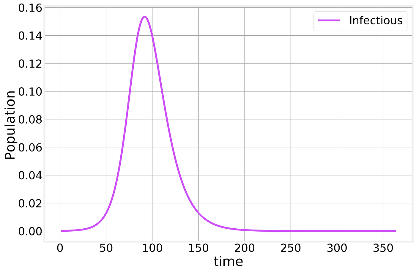
SIR Infectious compartment
Meaning that a significant fraction of the population can be infected at the same time, potentially causing (depending on the severity of the infection) the Healthcare system to become overwhelmed. When you hear about “flattening the curve” this is the curve that they are referring to.
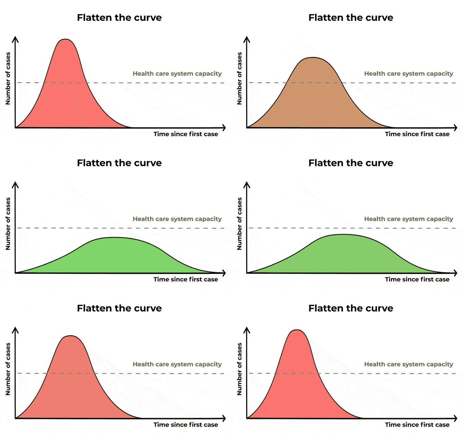
The Conversation/CC BY ND
From the mathematical expression of the SIR model above, a few interesting results can be easily obtained. If we focus on the early days of the epidemic spreading, we can assume that the fraction of Susceptible individuals is still ~1 and find:

The exponential that everyone is trying to fit! Here,

is pronounced “R naught” and is the Basic Reproduction Number of the disease. This simple number defines whether or not we have an epidemic. If Rₒ<1 the disease dies off, otherwise, it grows exponentially!
One intuitive way of interpreting the Rₒ is as the average number of new infections produced by a single infectious individual. If a person is able to spread the disease to at least another one before recovering, then the epidemic can continue, otherwise, it dies off.
This is what we need to determine and it depends on many different factors that are characteristic of the virus, as Kate Winslet eloquently put it in the 2011 movie, Contagion.
The current best estimates of the Rₒ value for SARS-CoV-2, the coronavirus that causes CoVID-19 is around 2.5.
The value of Rₒ also plays a fundamental role in determining the course of the epidemic. If we consider the second equation describing the SIR model:

We find that the derivative of the number of infectious becomes negative whenever:

This is the point at which we have reached the peak and the epidemic starts dying off. This is the point at which the population starts having enough of what is known as Herd immunity for the disease to be unable to spread further. Whenever vaccines are available, vaccination programs are designed to help the population reach herd immunity without having to get a significant fraction of the population infected.
Rₒ also determines the final fraction of the entire population that will be unaffected by the disease:

Where S_infinity refers to the total fraction of healthy (and never infected) individual after the epidemic has had time to follow its course completely. This expression isn’t amenable to closed form solution, but can be used to numerically estimate the value of S_infinity. The SIR figure above was generated by using Rₒ=2 and we see that S_infinity~0.2 which can be easily verified by plugging these numbers in this expression.
Practical considerations
So far, our analysis of epidemic models has focused on the ideal scenario which seems to justify the approach of fitting exponential curves as a simple way of trying to forecast the course of the epidemic. Unfortunately, the real world is significantly more complex in a variety of ways.
Asymptomatic and mildly infectious cases
One of the limitations of the approach described so far is that it makes a few unrealistic assumptions:
- There is no incubation or latent period. An incubation period delays the entire epidemic timeline. An issue that is not significant for our purposes here.
- There is a single type of infectious individual. In the real world, different immune systems respond differently to the virus resulting in some people being completely asymptomatic (no symptoms whatsoever) and mildly infectious cases. In the case of CoVID-19 the number of asymptomatic cases is thought to be 40% or higher.
Both of these difficulties can be addressed by adding new compartments and transitions to our basic SIR model without much difficulty. However, they pose significant challenges when dealing with the official published numbers.
In the early days of the epidemic, only the more severe cases (non-asymptomatic and non-mild) cases get sick enough to search medical help and be officially diagnosed. This naturally leads to a delay in detection of the first cases in a given city or country and an over-estimation of the severity of the disease as more severe cases are more likely to die.
Published numbers are also typically cumulative, making the total numbers appear larger. A simple way of extracting a measure of the number of possible confirmed cases from our simple SIR model is to count how many people have been removed from the Susceptible compartment. Defining ϕ to be the fraction of infectious cases that do get tested, we have:

Confirmed cases
As a result, the numbers that get published depend directly on the fraction of cases that are severe enough to both lead to medical attention and be tested:
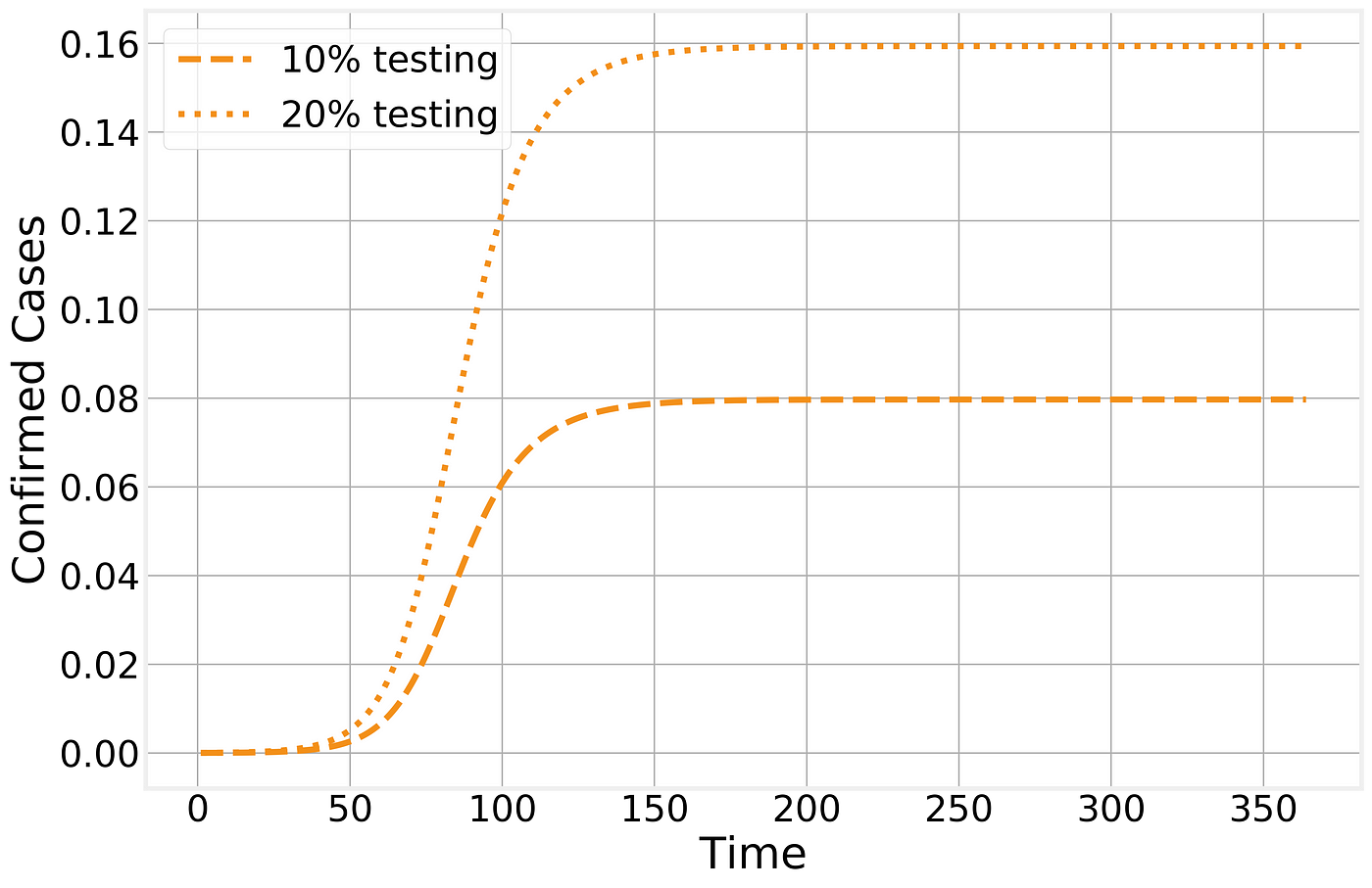
Confirmed cases in the SIR model
The number of (observed) Recovered individuals will then follow a similar trajectory, although with a f_ew days lag due to the natural time line of the disease:_

Observed recovered number of cases
Naturally, with novel diseases it takes time to develop and distribute accurate tests. If we further consider that the testing fraction ϕ is time dependent as well, then it is easy to see how a lot of the features observed in the time line of confirmed cases are caused by local policies and test availability:
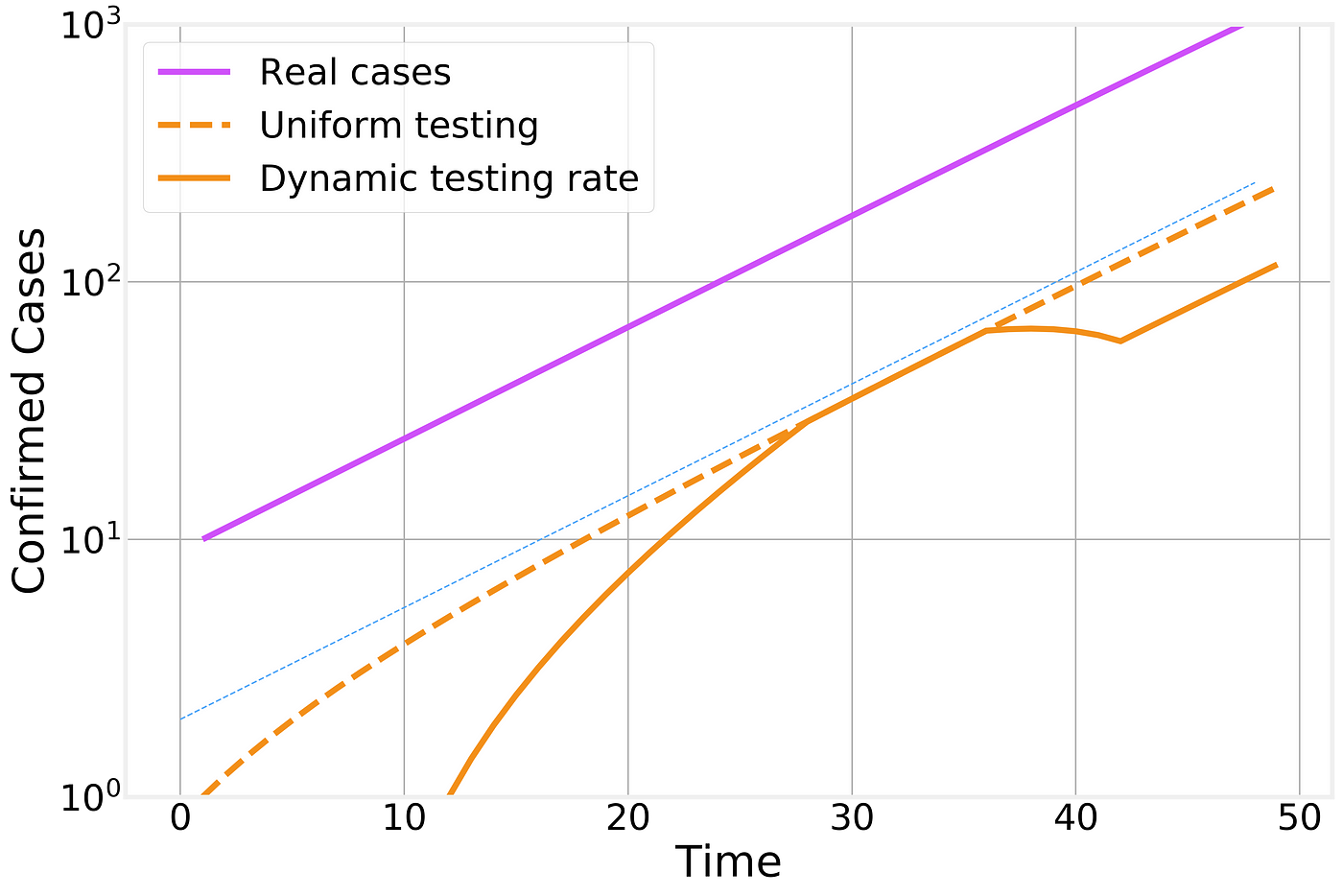
Effect of time dependent testing rate
In this figure we compare the number of real infectious cases (in purple), the result of uniform testing (dashed orange line) and dynamic testing rates (solid orange line). For clarity, we plot the different curves in a logarithmic scale (the change from one horizontal grid line to the next corresponds to a factor of 10x) and include an exponential fit line (thin blue line) as a guide to the eye that represents the overall exponential trend.
Dynamic lags
Another important factor to consider is the temporal evolution that is intrinsic to the disease progression. A healthy individual comes in contact with an infectious person and becomes infected. Her infection will last for a specific number of days, meaning that the current number of infectious individual is the sum of everyone who got infected today, yesterday, the day before, etc… and hasn’t had time to recover yet.
This implies that there is a natural lag between the peak of new infections and the peak in the total number of infectious individuals that is proportional to the duration of the infectious period.

Lag between the peak in new infections and in the number of currently infections individuals
One important consequence of this lag is that even if the number of new infections today is smaller than it was yesterday and the day before, it will take several days before the effects are noticeable as a reduction in the total number of infected cases.
Lockdown procedures
As the epidemic has progressed, many countries around the world, starting with China, have tried to implement lockdown or quarantine procedures to try to contain the spread of the disease. These measures have proven unpopular with the public due to their social and economic consequences, so it is important to understand the effect they have in stopping the epidemic spreading.
Let’s imagine the perfect containment scenario. I wave a magic wand and every one stays home, exactly 6 feet away from each other at all times and no new infections can be generated. In our SIR framework, this corresponds to suddenly setting Rₒ=0 or simply eliminating the interaction transition from the model. The results are stunning:
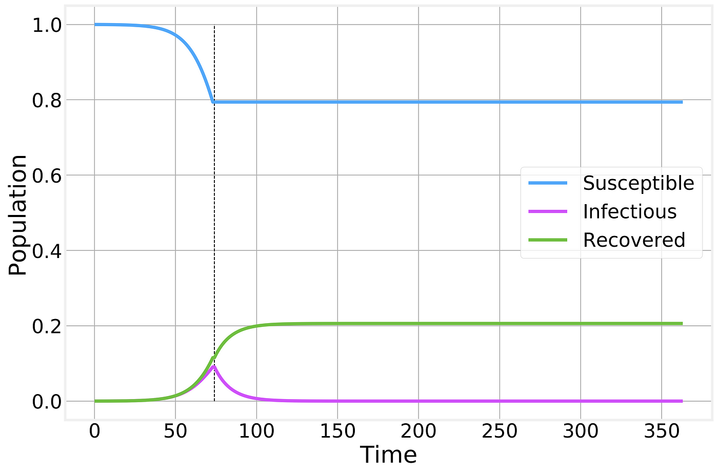
Perfect containment strategy. Strategy is implemented at the time indicated by the vertical dashed line and maintained as long as necessary for the number of infectious individuals to reach zero.
While no new infections are generated, the total number of infected individuals still remains high for several weeks as the currently affected people gradually recover from the disease.
Naturally, no containment strategy is perfect, but let’s say we do a pretty good job and instead of driving the Rₒ to 0 we managed to drive it to 0.5. As we’ve shown above, whenever Rₒ<1 the epidemic starts to die off, but it takes significantly longer than in the ideal scenario and results in a larger number of total infections:

Imperfect containment strategy. Strategy is implemented at the time indicated by the vertical line and maintained for as long as necessary for the number of infected to reach zero. Thin solid lines correspond to the previous perfect scenario and are shown for comparison.
If however, for some reason, the social or economic costs of the lockdown are deemed to be too costly and the quarantine is lifted prematurely we simply return to the previous, unrestrained, epidemic spreading scenario:
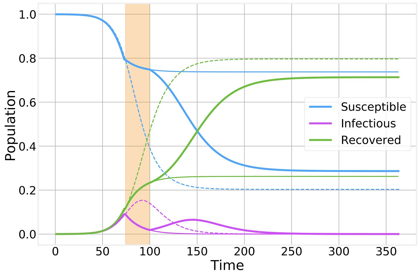
Imperfect containment strategy. Strategy is implemented at the time indicated by the vertical shaded area. Dashed and thin solid lines correspond to the no-intervention and imperfect lockdown scenarios, respectively, and are shown for comparison.
As we can see, a prematurely broken lockdown quickly results in a second wave of the epidemic leading to almost as many total cases as if there had been no intervention whatsoever. However, it does still have the benefit of keeping the peak number of sick individuals below what would normally be and a “spreading out” of the epidemic curve: In other words, the flattening of the curve that will help prevent the overwhelming of the healthcare system.
For clarity, let’s also take a look at just the number of infectious cases
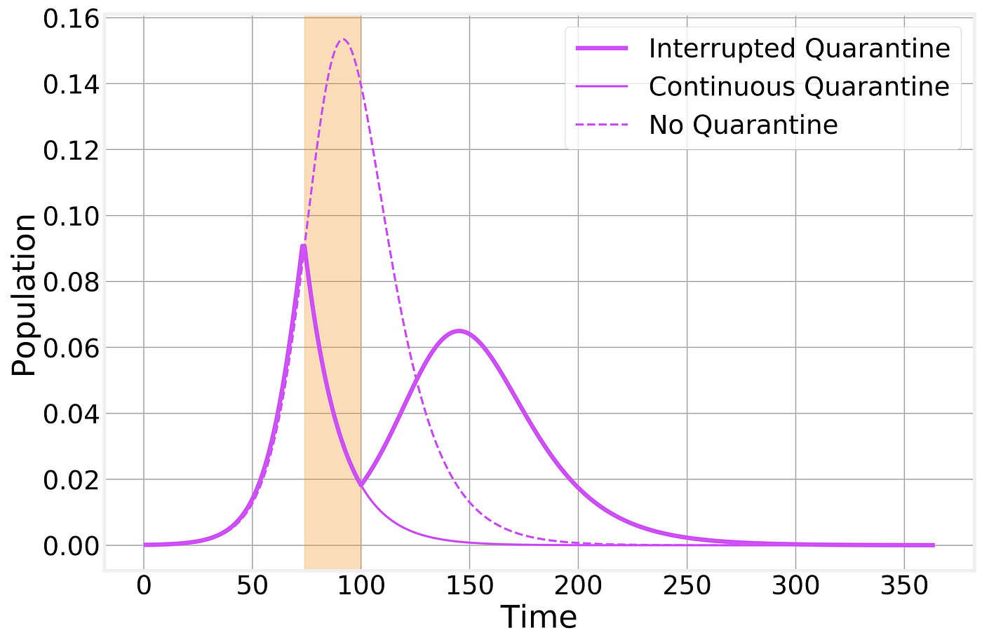
Imperfect containment strategy. Strategy is implemented at the time indicated by the vertical shaded area. Dashed and thin solid lines correspond to the no-intervention and imperfect lockdown scenarios, respectively, and are shown for comparison.
It is not for a poor Physicist such as myself to opine on whether or not the current world wide shutdown is worth it economically or socially. The best I can do is help you understand better its practical effects.
Structured populations
This post is already extremely long, but I would like to consider one extra point. Compartmental models, by their very nature make significant simplifications and assumptions. One fundamental assumption is that the underlying population is well mixed: every individual is in potential contact with any other individual. While this is clearly false for any large population, it is often a good enough approximation for qualitative analysis of epidemic dynamics.
However, if we try to overextend this kind of models, we quickly discover that countries and cities are not homogeneous populations. Countries are made up of states, states are constituted by cities and rural areas, etc.
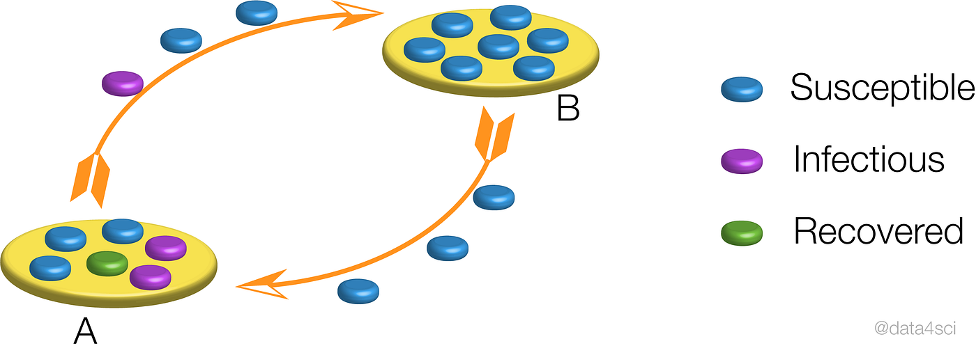
Schematic representation of the epidemic in between neighboring populations.
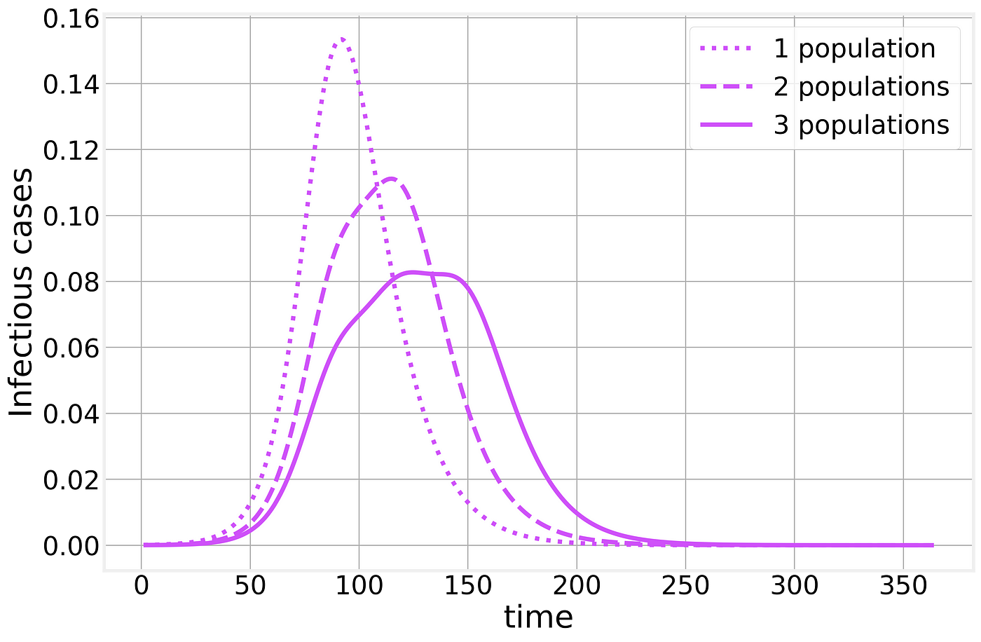
Within each population, the epidemic will proceed as we have described above but when we combine multiple populations the results are much less clear. Let us consider two populations, say two neighboring cities. The epidemic starts in one of them and through commuting or traveling, eventually, one infectious individual will infect the neighboring city, resulting in a timing difference between the two populations. If we naively treat these multiple populations as a single one (as when looking only at state or country totals) the resulting curve is strongly affected by the timing difference between the two populations, resulting in epidemic curves that bare little to no similarity to the simple examples we’ve analyzed so far, making any time of exponential fitting an idle pursuit with little to no practical use.
Suggest:
☞ Python Tutorials for Beginners - Learn Python Online
☞ Learn Python in 12 Hours | Python Tutorial For Beginners
☞ Complete Python Tutorial for Beginners (2019)
☞ Python Programming Tutorial | Full Python Course for Beginners 2019