Building COVID-19 interactive dashboard from Jupyter Notebooks

With the world coming to a standstill, thousands losing their lives and economies under free fall. The outbreak of COVID-19 novel coronavirus SARS-CoV-2 has highjacked the entire planet right now.
Under the lockdown, I decided to go through a few data repositories and started wrangling and plotting data. After a while, I decided to create a dashboard out of my jupyter notebook. I am going to walk you through the steps I undertook with code snippets:
Table of contents:
- Gather data from reliable and updating sources
- Clean and prepare the data.
- Visualize N number(using ipywidgets) of worst-hit countries using Plotly scatter plot.
- Plot confirmed and death cases for the requested country.
- Plot all cases on the world map using Folium
- Convert the Notebook into a material theme-based Voila dashboard.
Gather data from reliable and updating sources
I gathered my data from the 2019 Novel Coronavirus COVID-19 Data repository by John Hopkins CSSE.
https://github.com/CSSEGISandData/COVID-19
The data here gets updated every 24 hours from the official sources. I accessed the raw files from thecsse_covid_19_time_series directory.
Here is how I am reading the file using pandas’ read_csv() method:
# loading data right from the source:

death_df = pd.read_csv('https://raw.githubusercontent.com/CSSEGISandData/COVID-19/master/csse_covid_19_data/csse_covid_19_time_series/time_series_covid19_deaths_global.csv')
confirmed_df = pd.read_csv('https://raw.githubusercontent.com/CSSEGISandData/COVID-19/master/csse_covid_19_data/csse_covid_19_time_series/time_series_covid19_confirmed_global.csv')
recovered_df = pd.read_csv('https://raw.githubusercontent.com/CSSEGISandData/COVID-19/master/csse_covid_19_data/csse_covid_19_time_series/time_series_covid19_recovered_global.csv')
country_df = pd.read_csv('https://raw.githubusercontent.com/CSSEGISandData/COVID-19/web-data/data/cases_country.csv')
loading_data.py
Let’s have a brief look at the dataframe returned from reading the file. The structure of confirmed_df.head() or .info() method.

The structure of confirmed_df, recovered_df and death_df is the same and they store the confirmed, recovered and death cases in each country’s province/state respectively. Countries are in alphabetical order.
We have the data from the 22nd Jan 2020 up till the date you accessed it on.
From the column names, you can see that there is a need for cleaning them a bit to make further analysis easy to work with. The next step then is to prepare the data.
Data Cleaning
Firstly, it is always easy to work with column names that are in lowercase. Also, we need to change the Province/State to simply state and Country/Region to country.
Let’s rename all the columns in the required format:
# renaming the df column names to lowercase
country_df.columns = map(str.lower, country_df.columns)
confirmed_df.columns = map(str.lower, confirmed_df.columns)
death_df.columns = map(str.lower, death_df.columns)
recovered_df.columns = map(str.lower, recovered_df.columns)

# changing province/state to state and country/region to country
confirmed_df = confirmed_df.rename(columns={'province/state': 'state', 'country/region': 'country'})
recovered_df = confirmed_df.rename(columns={'province/state': 'state', 'country/region': 'country'})
death_df = death_df.rename(columns={'province/state': 'state', 'country/region': 'country'})
country_df = country_df.rename(columns={'country_region': 'country'})
data_preparation.py
Now, with all the columns in the right format, there is a bunch of stuff that we can do with them.
Let’s calculate the total number of confirmed, death and recovered cases out there. We can use the country_df for that:
# total number of confirmed, death and recovered cases
confirmed_total = int(country_df['confirmed'].sum())
deaths_total = int(country_df['deaths'].sum())
recovered_total = int(country_df['recovered'].sum())
active_total = int(country_df['active'].sum())
total_cases.py
Visualizing the worst-hit countries
Analyzing the data in alphabetical order is a bad idea for countries that are struck severely. We’ll need to sort the values on the basis of the number of cases that the country has. Using the country_df, we have:
sorted_country_df = country_df.sort_values('confirmed', ascending= False)
We can have the required columns highlighted in the dataframe, I’ve written a function to add style to my dataframe columns using the style attribute:
def highlight_col(x):
    r = 'background-color: red'
    p = 'background-color: purple'
    g = 'background-color: grey'
    df1 = pd.DataFrame('', index=x.index, columns=x.columns)
    df1.iloc[:, 4] = p
    df1.iloc[:, 5] = r
    df1.iloc[:, 6] = g
    return df1
Here, I added the ipywidget interact() method to provide an option for choosing the number of worst-hit countries you want to look at.
def show_latest_cases(n):
    n = int(n)
    return country_df.sort_values('confirmed', ascending= False).head(n).style.apply(highlight_col, axis=None)

interact(show_latest_cases, n='10')
show_cases.py
We get a text box to enter the number of rows we want along with the highlighted columns:

Plotly to visualize the data
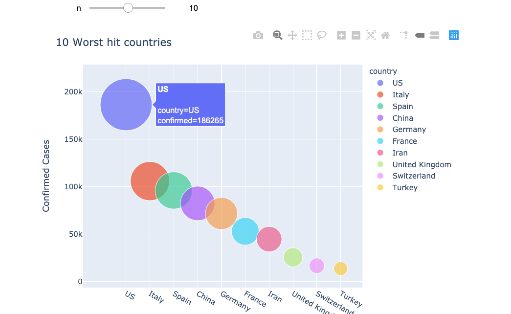
That was displaying the data, now plot the data that we have using the Plotly library. We plot the same worst-hit countries along with a slider option to change the number of countries we want on display:
def bubble_chart(n):
    fig = px.scatter(sorted_country_df.head(n), x="country", y="confirmed", size="confirmed", color="country",
               hover_name="country", size_max=60)
    fig.update_layout(
    title=str(n) +" Worst hit countries",
    xaxis_title="Countries",
    yaxis_title="Confirmed Cases",
    width = 700
    )
    fig.show()

interact(bubble_chart, n=10)
Plotly renders high-quality interactive charts, here is what the data looks like now:

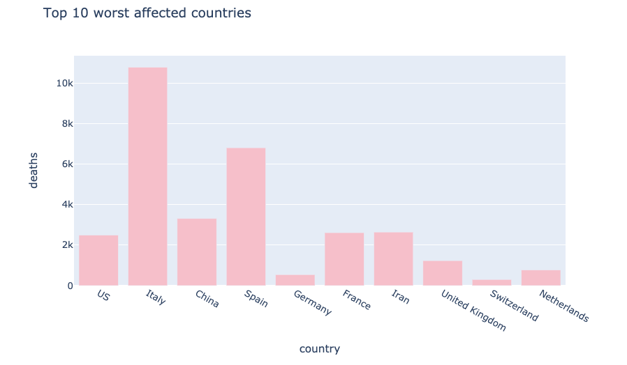
We can also have bar plots using plotly to visualise all the different cases using this code snippet:
px.bar(
    sorted_country_df.head(10),
    x = "country",
    y = "deaths",
    title= "Top 10 worst affected countries", # the axis names
    color_discrete_sequence=["pink"],
    height=500,
    width=800
)
bar_plot.py
This plot displays the worst affected countries in terms of deaths using bar plots:

Plot confirmed and death cases for the requested country
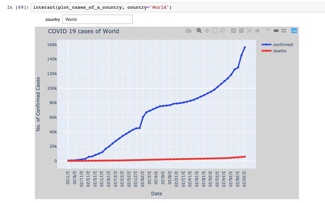
It’s time to dive one level deeper into the analysis and talk about visualizing daily cases of each country. We are going to write a function that takes the country as input and displays the confirmed and death cases for each day.
This will help us visualize the chart and the pace with which the cases are increasing.
The function plot_cases_for_country() iterates over the confirmed_df and death_df to store the X-axis and Y-axis data for the requested country and then passed onto the plotly’s scatter traces using the go.Scatter() function**.** You can find the code of this function on my GitHub repository.
The function is then added with an interactive text box which allows you to enter your choice of the country as shown below:

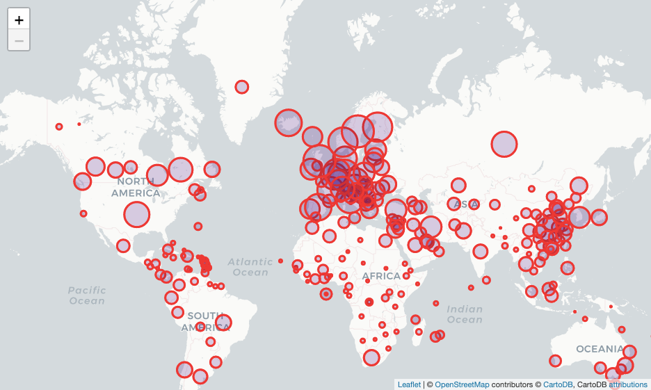
Global spread on the world map using Folium
Folium is a python package that helps us visualize the python manipulated data on an interactive leaflet map. It provides a number of built-in tilesets to choose from. The quickstart examples are a great help to get started.
Now creating a Map() class object by passing the starting coordinates as location argument, tiles that you want to choose and the zoom levels.
Iterating over the confirmed_dfrows, we need the lat and long of each country to place the marker over it. We can use the folium.Circle() class to create the markers with the required attributes like radius, color and filling color.
# creating world map using Map class
world_map = folium.Map(location=[11,0], tiles="cartodbpositron", zoom_start=2, max_zoom = 6, min_zoom = 2)
# iterate over all the rows of confirmed_df to get the lat/long
for i in range(0,len(confirmed_df)):
    folium.Circle(
        location=[confirmed_df.iloc[i]['lat'], confirmed_df.iloc[i]['long']],
        fill=True,
        radius=(int((np.log(confirmed_df.iloc[i,-1]+1.00001)))+0.2)*50000,
        color='red',
        fill_color='indigo',
    ).add_to(world_map)

world_map
Here is how the above function renders the map:

Convert the Notebook into a standalone dashboard
With all the analysis done, it’s time to communicate our findings and visuals. The management(non-technical reader) often isn’t interested in looking at the code. Given a dashboard to interact and work with makes life a lot easier for all of us.
Creating dashboards right from your jupyter notebook analysis can be done flawlessly using Voilà. It turns Jupyter notebooks into standalone web applications. Here are a few features of Voilà:
- Supports Jupyter interactive widgets.
- Does not permit arbitrary code execution.
- Language agnostic dashboarding system — built upon Jupyter standard protocols and file formats, voilà works with any Jupyter kernel (C++, Python, Julia).
- Voilà is extensible. It includes a flexible template system to produce rich application layouts.
Make sure that you have the voilapackage installed.
- Command to install Voila:
pip install voila or using conda foge, conda install voila -c conda-forge
- In the terminal, enter the command:
voila <path to your notebook> <command-line options>
- I used the dark theme using the option
--theme=darkand the material template using--template=material.
We can make use of templates to make the dashboard look rich and attractive. Here’s a walkthrough of my dashboard using material template:

Data Science with Harshit
With this channel, I am planning to roll out a couple of series covering the entire data science space. Here is why you should be subscribing to the channel:
- The series would cover all the required/demanded quality tutorials on each of the topics and subtopics.
- Explained Mathematics and derivations of why we do what we do in ML and Deep Learning.
- Podcasts with Data Scientists and Engineers at Google, Microsoft, Amazon, etc, and CEOs of big data-driven companies.
- Projects and instructions to implement the topics learned so far.
Suggest:
☞ Python Tutorials for Beginners - Learn Python Online
☞ Learn Python in 12 Hours | Python Tutorial For Beginners
☞ Complete Python Tutorial for Beginners (2019)
☞ Python Programming Tutorial | Full Python Course for Beginners 2019